A complete brand identity and digital presence for a Venezuelan popup food shop — from logo to website to market-day signage.
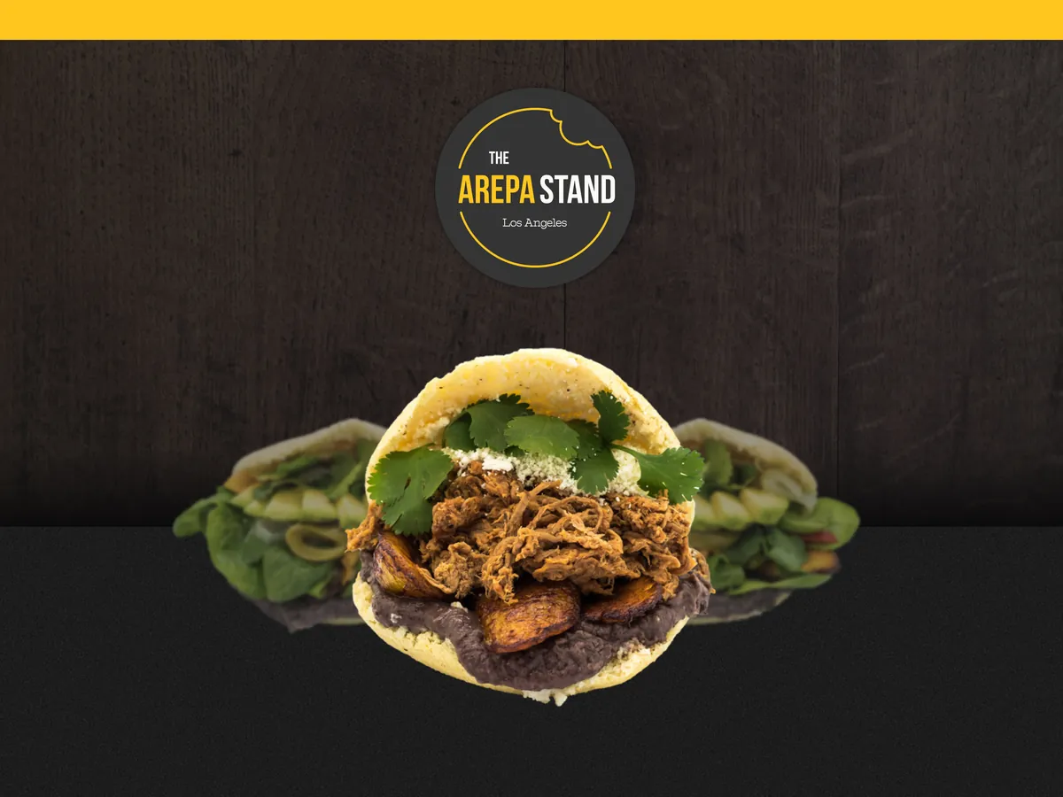
The Arepa Stand is a popup food shop found at different farmers markets around the Los Angeles area, serving authentic Venezuelan arepas. The business needed a memorable, professional brand identity that could stand out in the crowded and competitive LA farmers market scene.
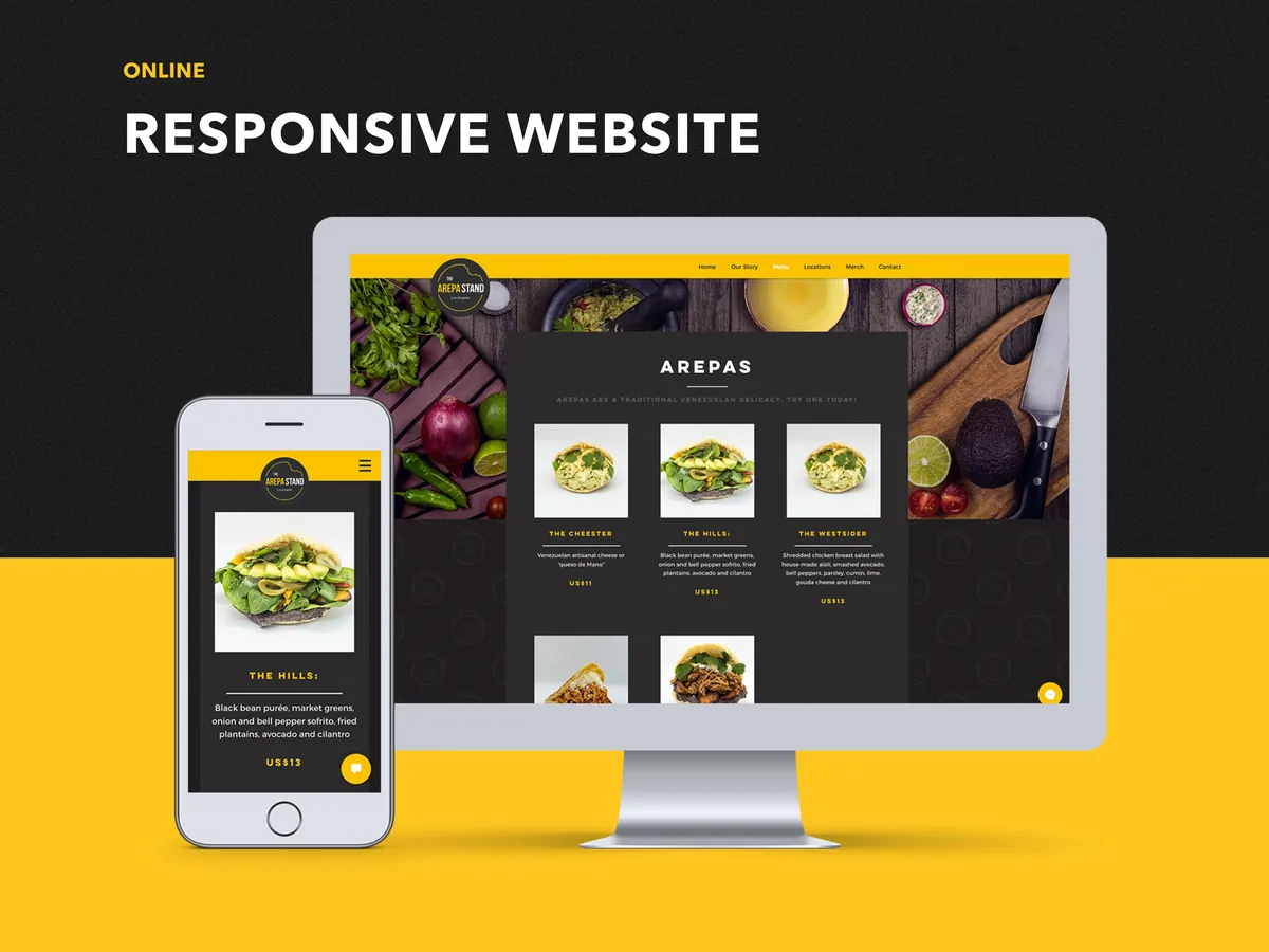
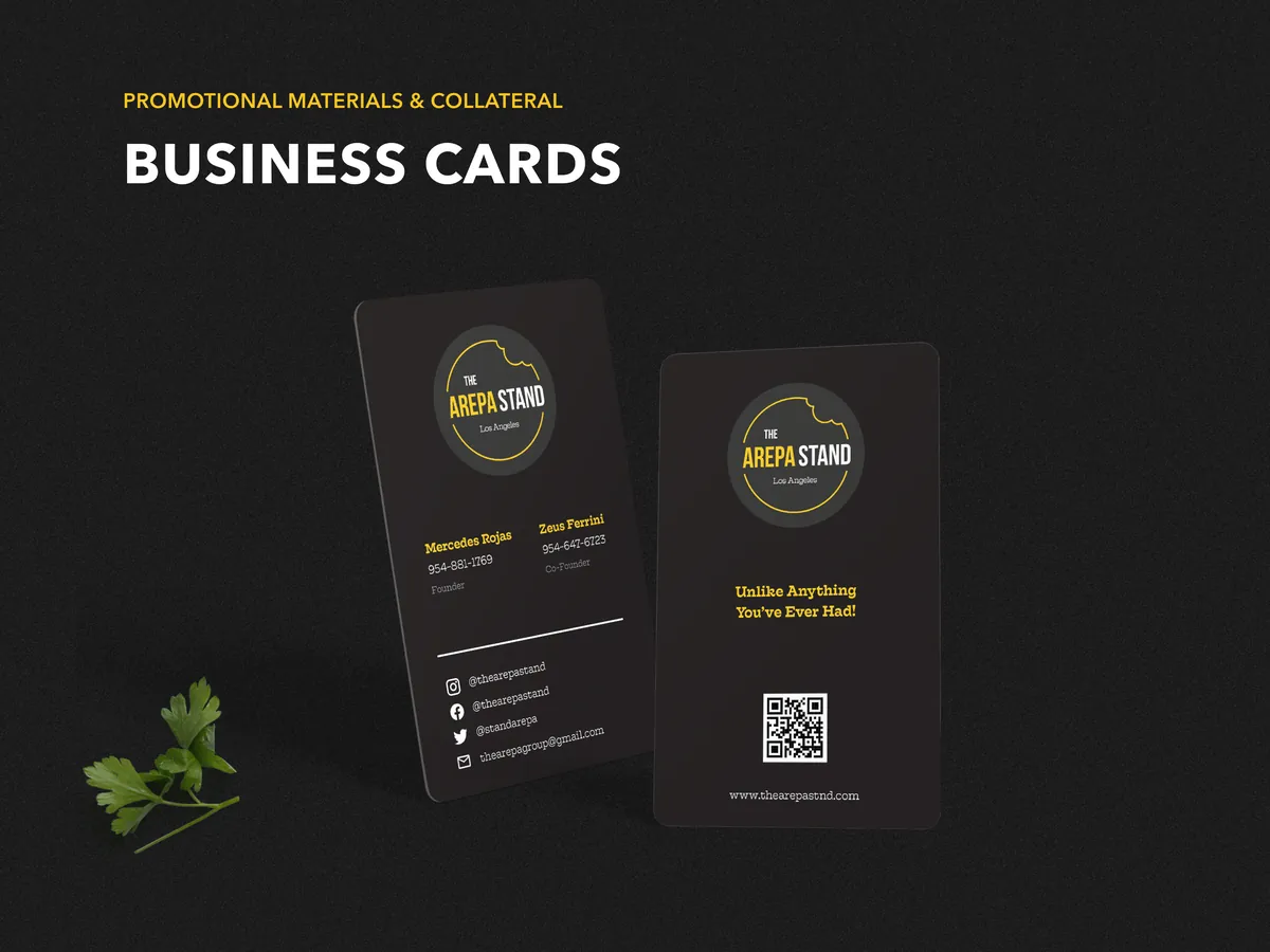
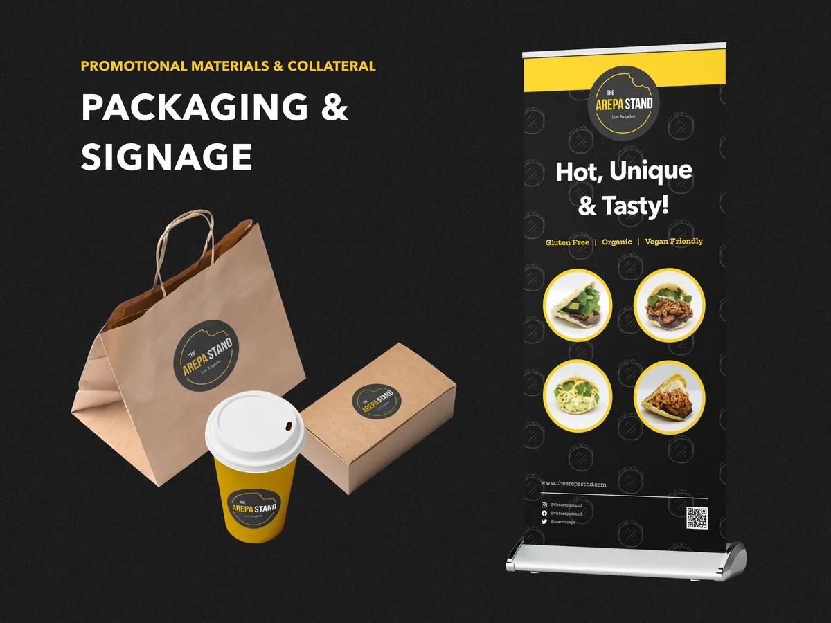
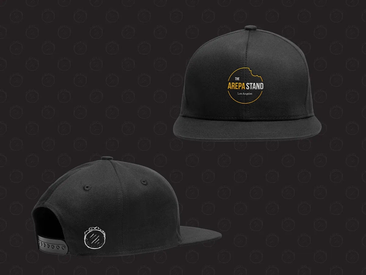
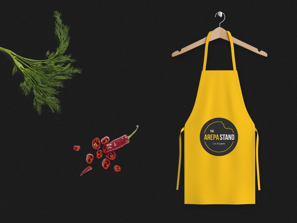
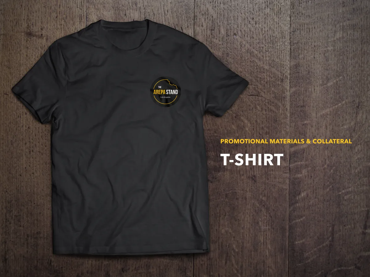
Without a cohesive visual presence, the brand relied on word-of-mouth alone. To grow beyond a single market and attract new customers at each location, The Arepa Stand needed a system — not just a logo, but a full identity that worked across signage, social media, packaging, and web.
Create a complete brand identity and digital presence that positions The Arepa Stand as a recognizable, trustworthy food brand across every customer touchpoint:
A full brand ecosystem designed for a food business that lives both in-person and online.
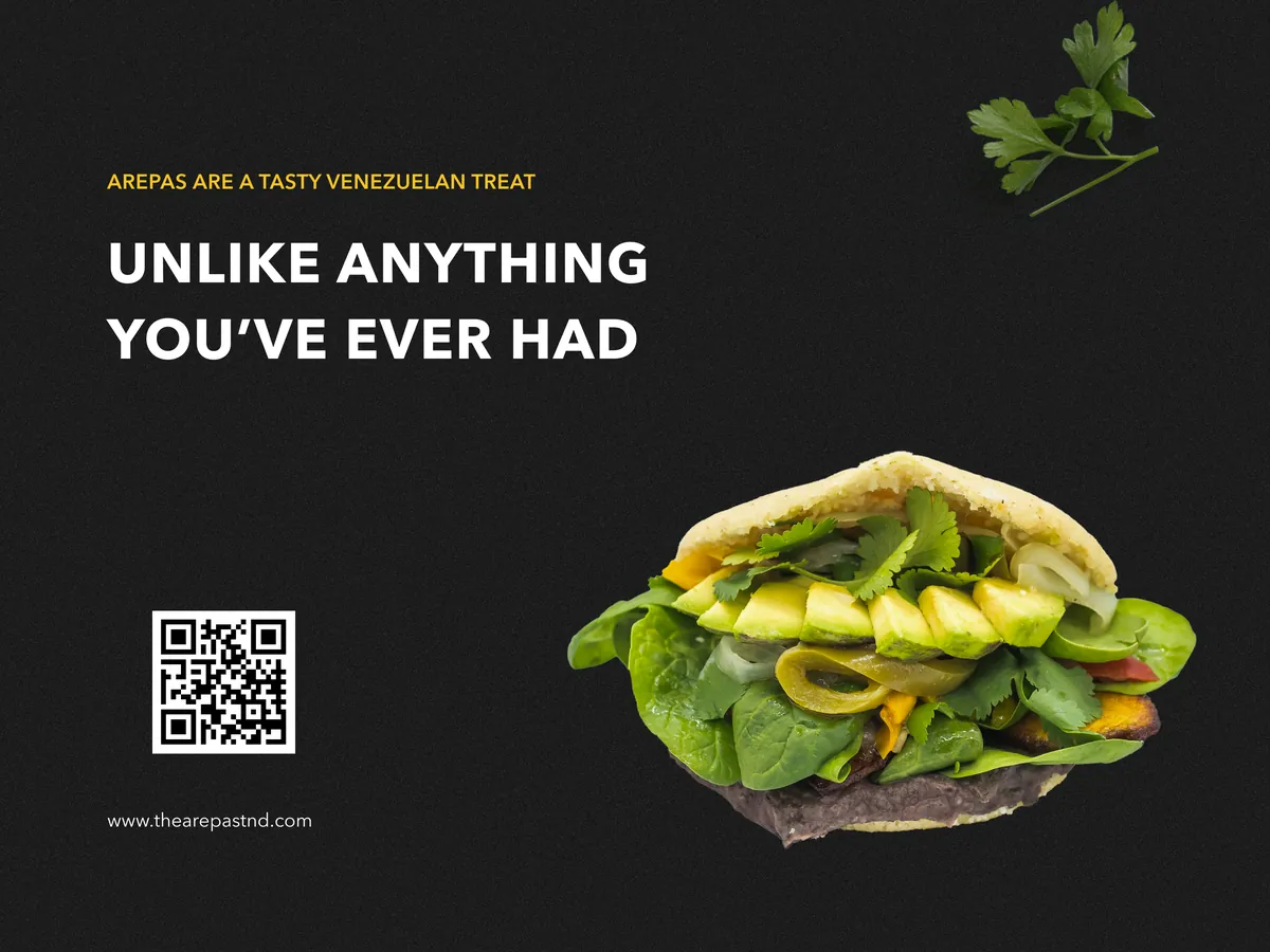
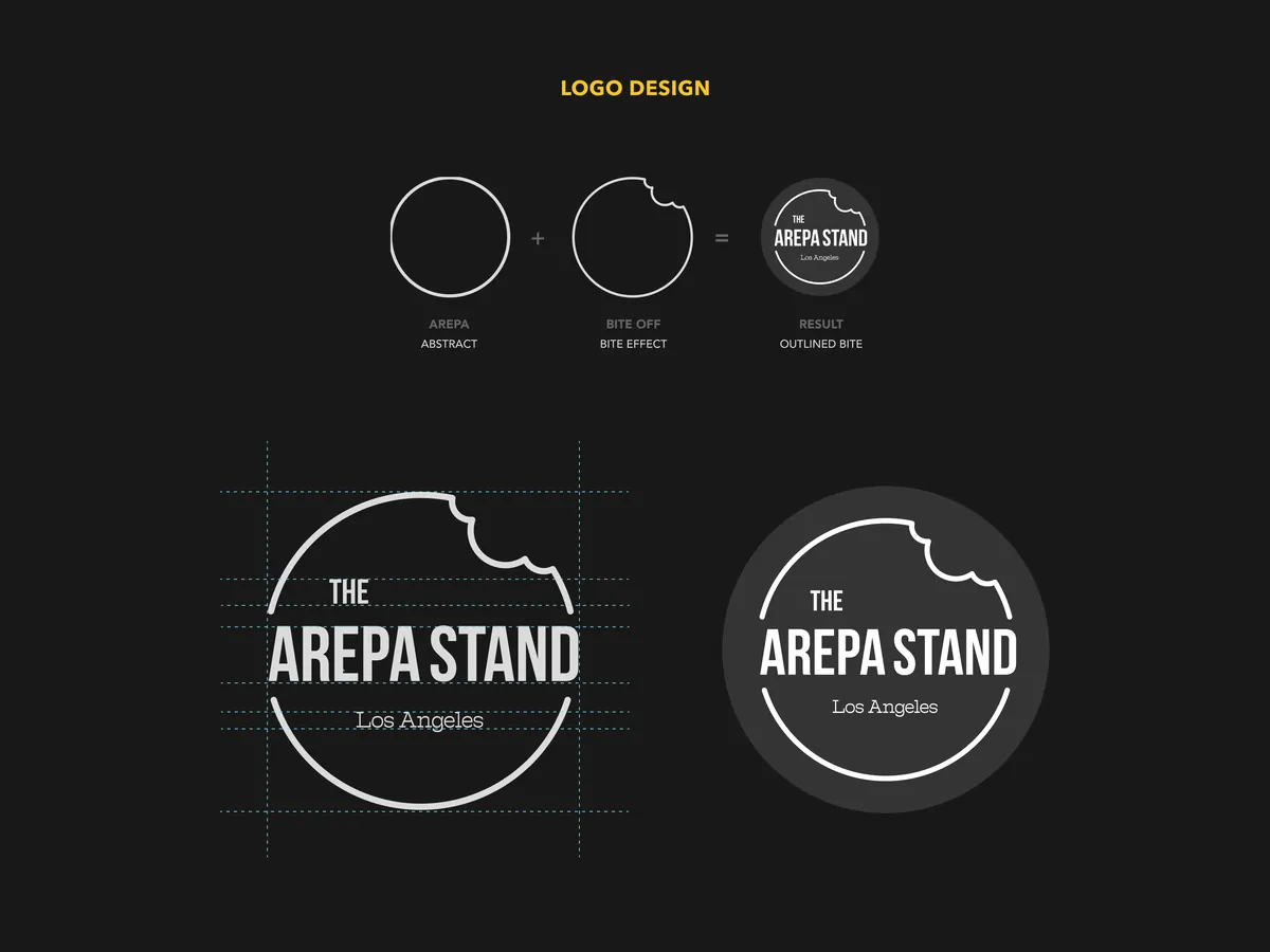
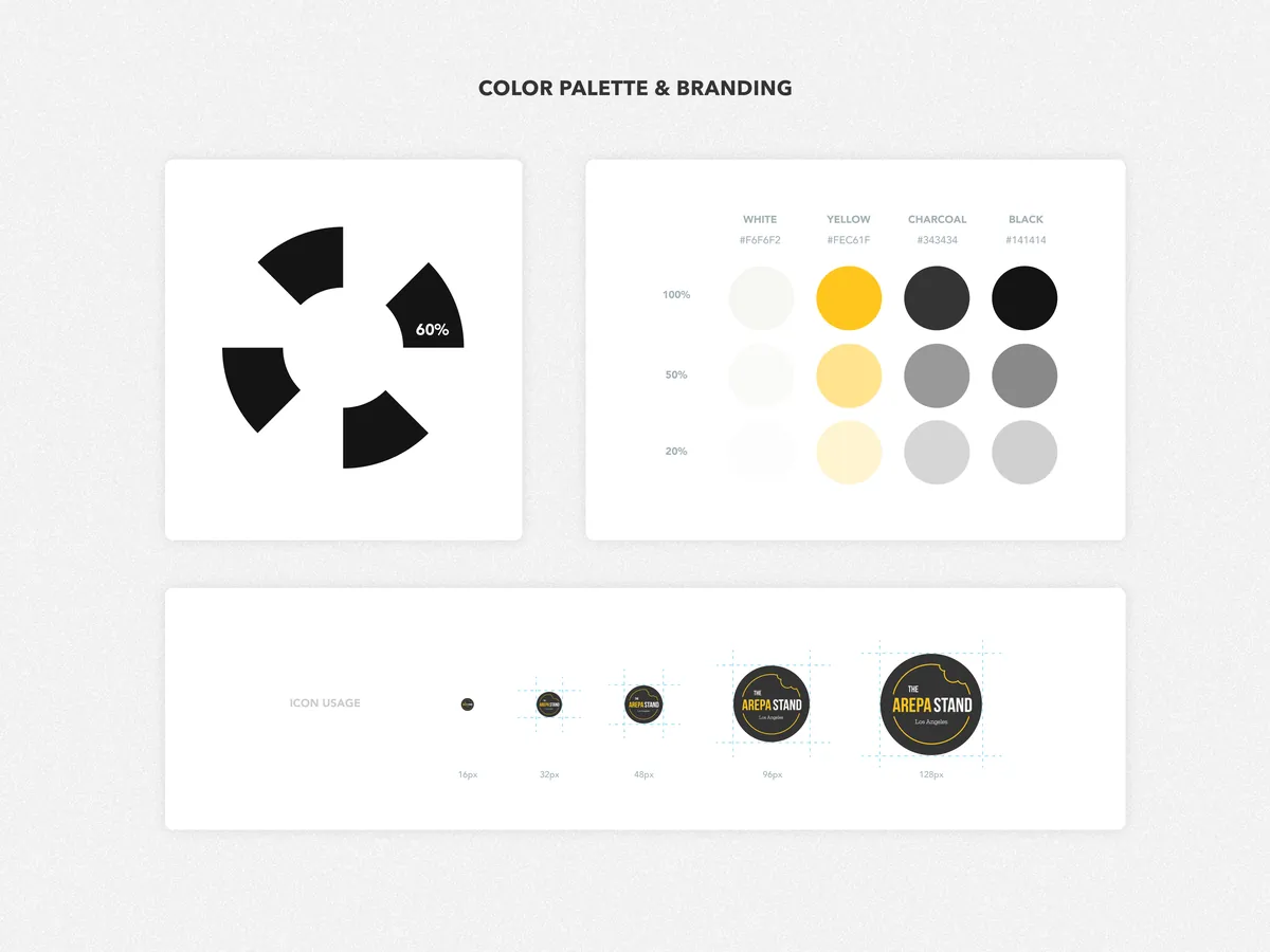
The visual language draws from the boldness of street food culture — dark, moody tones that let the food photography pop, paired with a gold-and-black palette that communicates quality without pretension.
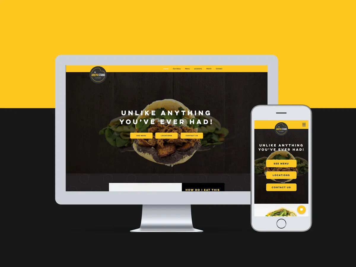
The Arepa Stand went from having no visual identity to owning a complete brand system that works as hard as the business does — at the market, on social media, and online.
The brand now has a professional, recognizable presence that builds trust with new customers before they even take a bite. Every touchpoint — from the banner behind the stand to the Instagram grid to the website — tells the same story: authentic Venezuelan food, made with care.