A full website, brand identity, and content strategy for a Dominican Republic-based wellness coach — designed and developed end-to-end in Webflow.
The main challenge was translating a personal coaching brand into a structured digital experience that feels both personal and credible.
Key challenges included
The design needed to balance personality with clarity, making the website informative without feeling overwhelming.
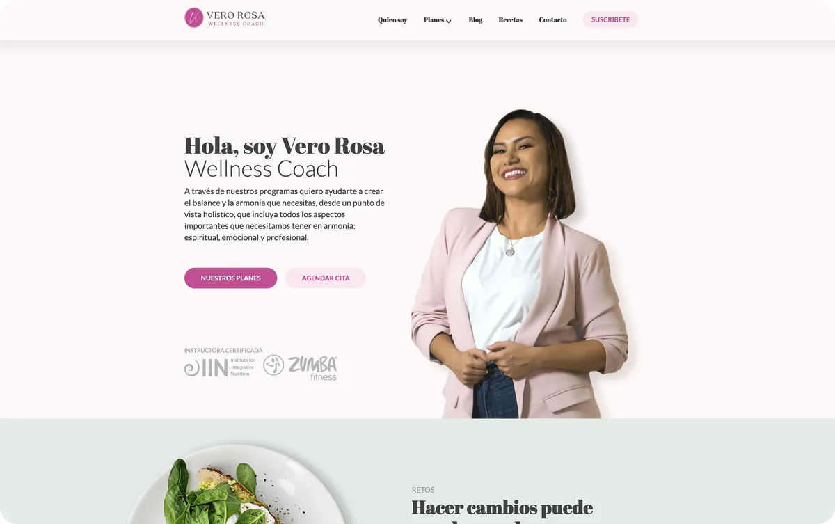
The objective of this project was to design a website that clearly communicates Vero Rosa's wellness coaching services while creating a welcoming and trustworthy online presence. The site needed to:
The goal was to build a digital experience that balances personal storytelling with clear service communication, supporting both brand credibility and client conversion.
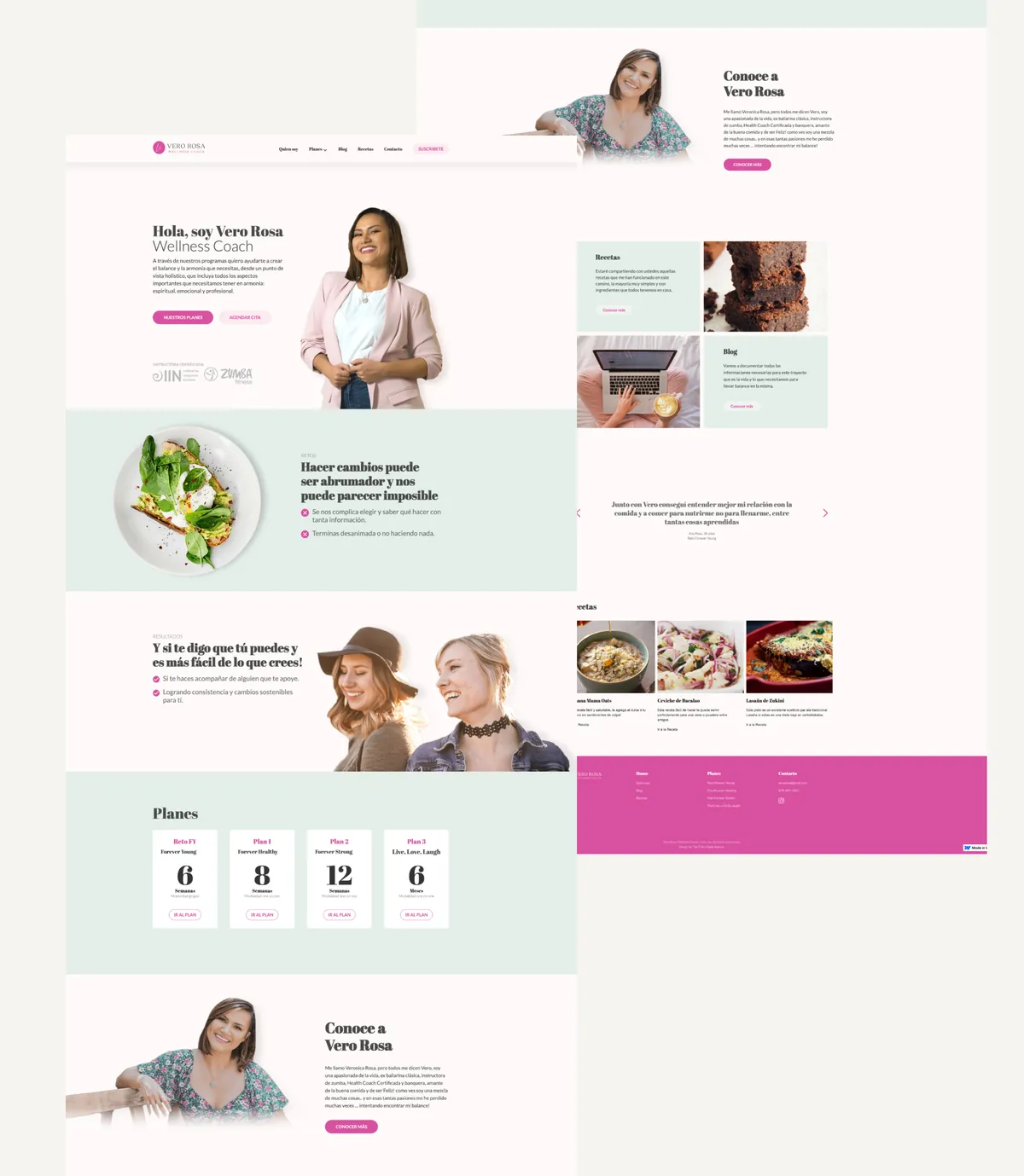
The website was structured to guide visitors through Vero Rosa's coaching philosophy, services, and programs while making it easy to understand how to work with her. Structured around destination funnels instead of generic listings.
The project began with defining the site structure and user flow, identifying the main pages needed to explain Vero's services and philosophy.
Wireframes were created to organize content and ensure the website would guide users naturally through the experience.
After the structure was finalized, the design moved into high-fidelity layouts, focusing on typography, imagery, and spacing to create a calm and inviting aesthetic aligned with the wellness industry.
This was a full end-to-end project — from brand identity to live website. Every element was designed to work together as a cohesive system.
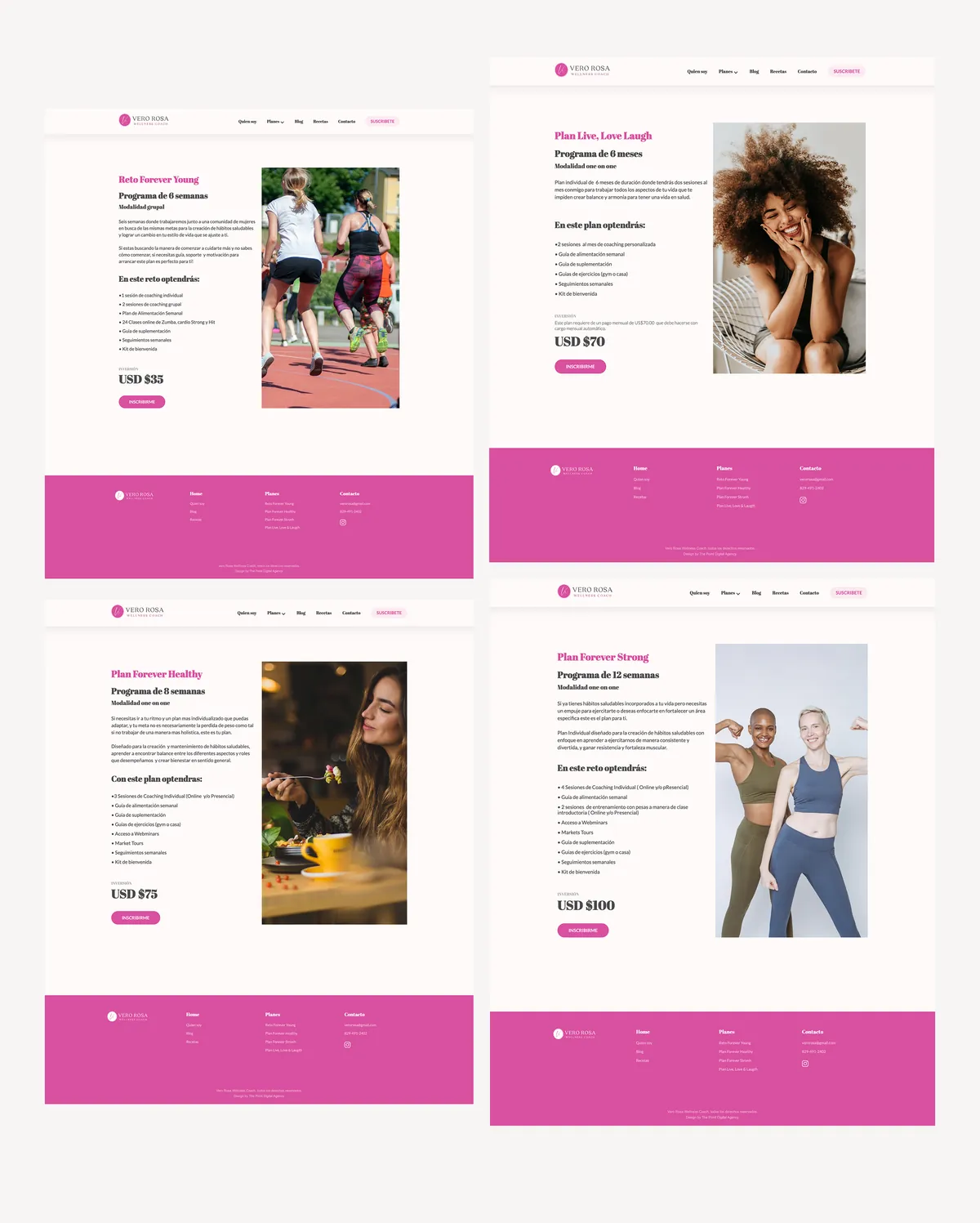
The program includes four different plans, each with its own dedicated page. This structure allows users to explore the details of each option individually, including what the plan includes, who it is designed for and the specific benefits offered. Separating the plans into individual pages improves clarity, makes the content easier to navigate, and helps guide users toward selecting the option that best fits their goals.
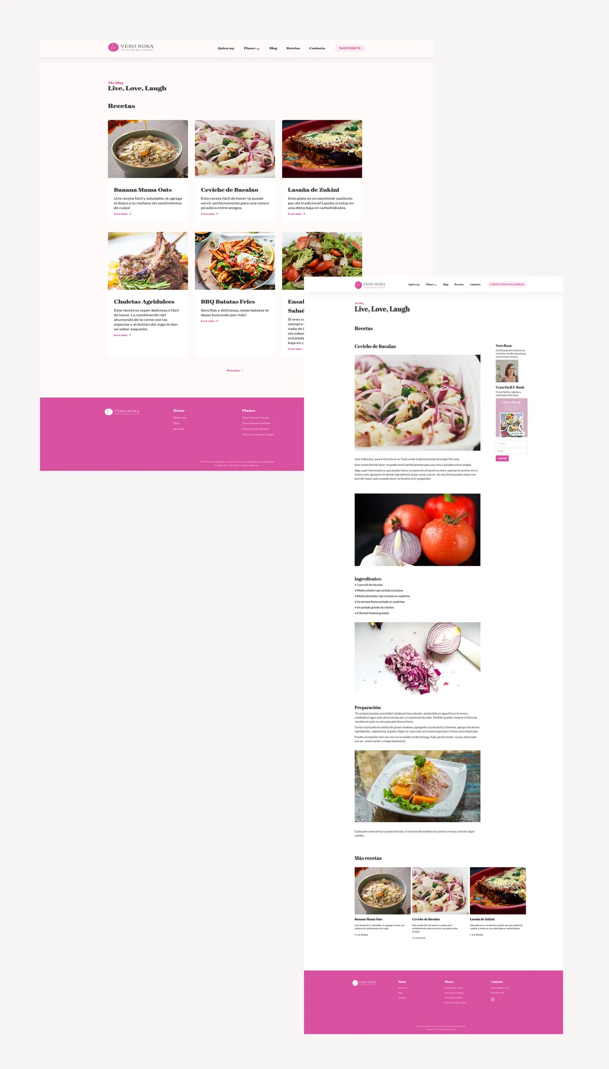
The recipes section was designed not only to provide valuable nutritional content but also to support the brand's marketing strategy. Each recipe is structured in a clear and visually engaging way, highlighting ingredients, preparation steps, and benefits.
The recipes were also created to be easily repurposed for platforms like Pinterest and Instagram, allowing the brand to share attractive, educational content that drives traffic back to the website. This approach helps expand reach, attract new users, and bring consistent organic traffic into the program ecosystem.
As part of the project, the branding was developed to create a cohesive and recognizable identity across all touchpoints. This included the design of the logo, digital assets, and branded materials such as ebooks. The goal was to establish a visual language that reflects the brand's focus on wellness, clarity, and approachability while remaining consistent across the website, educational resources, and marketing content.
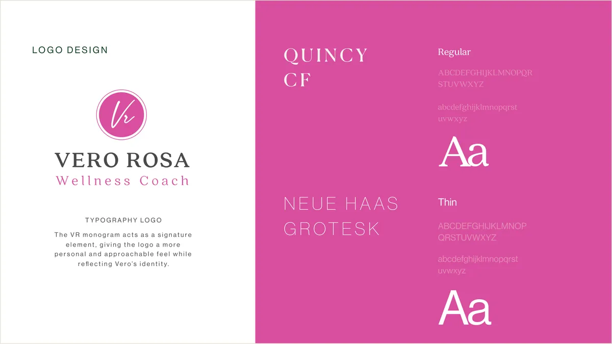
The logo was designed to reflect a clean and modern wellness brand. The typography is simple and elegant, helping communicate professionalism while remaining approachable for the target audience. The color palette and overall style align with the brand's focus on balance, health, and lifestyle transformation.
The logo also works effectively across different formats and assets, maintaining visual consistency whether it appears on the website, social media, ebooks, or other branded materials. This flexibility ensures the brand remains recognizable and cohesive across all platforms.
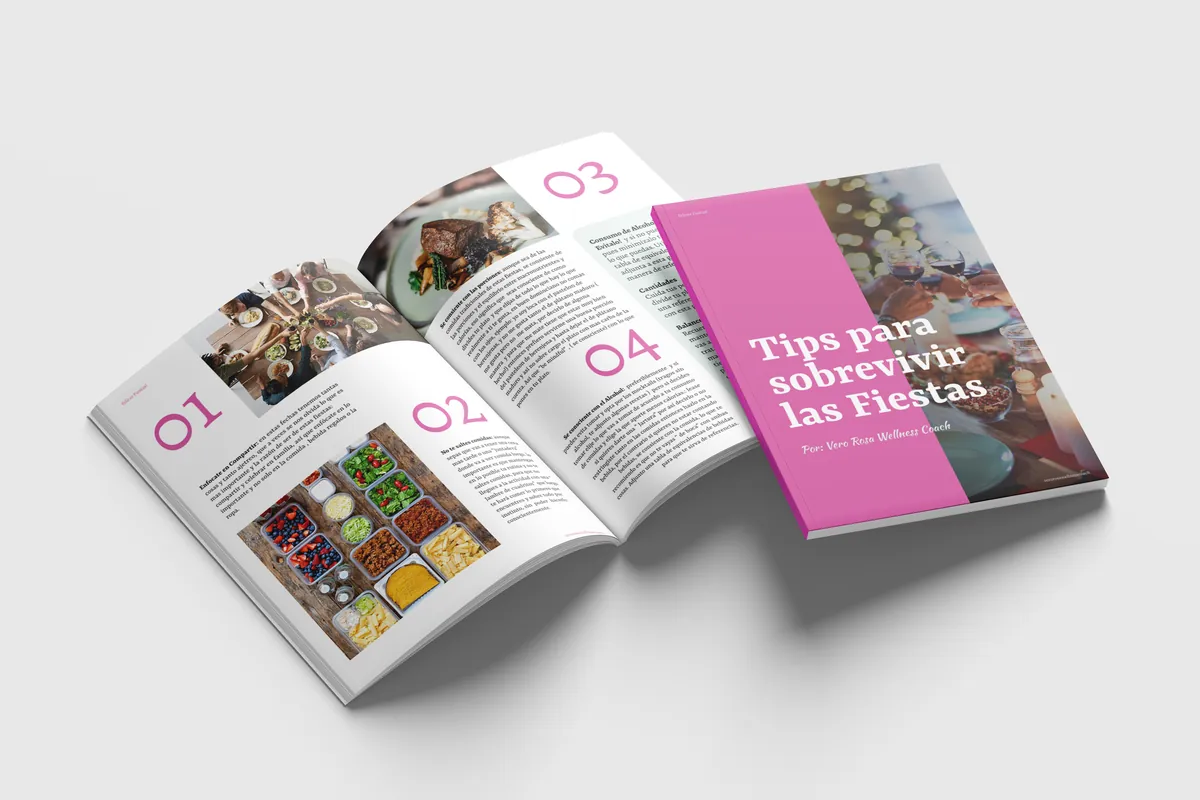
The final result was a cohesive brand identity that supports both the website and the broader content strategy. The logo and visual assets created a consistent look across the website, ebooks, and marketing materials, helping strengthen the brand's recognition and credibility.
This unified branding system also made it easier to produce content for platforms such as Pinterest, Instagram, and digital resources, ensuring that every touchpoint maintains the same visual language while driving traffic back to the website and supporting the overall growth of the brand.