The luxury paradox
There's a strange thing that happens when luxury brands move online. Brands that feel effortlessly premium in physical form — through packaging, retail environments, printed materials — suddenly feel ordinary the moment they launch a website or post on Instagram.
The problem isn't digital. The problem is translation. Most luxury brands treat digital as a broadcasting channel rather than an extension of the brand experience. They upload the same imagery, use the same copy, and wonder why the feeling doesn't transfer.
Premium positioning isn't about being expensive. It's about being precise — in every decision, at every touchpoint.
This is what makes luxury brand website design fundamentally different from regular web design. It's not about adding more — it's about choosing better. Every pixel, every word, every interaction has to earn its place. The brands that understand this create digital experiences that feel like walking into their flagship store. The ones that don't create websites that feel like browsing a catalog.
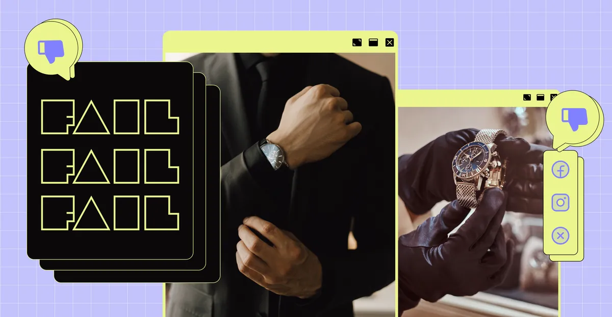
Where most brands go wrong
After working with several luxury and premium brands, I've noticed the same patterns repeated across industries. The failures tend to cluster around a few core mistakes:
- Treating digital as a catalog. Luxury is about curation, not inventory. A website that lists everything you offer communicates abundance — not exclusivity.
- Copying aesthetics without understanding principles. Dark backgrounds and serif fonts don't make something luxury. They're surface-level signals that sophisticated buyers see through immediately.
- Inconsistent voice. A brand that sounds elevated in its print materials but casual on Instagram breaks the spell. Consistency across every touchpoint is non-negotiable.
- Optimizing for conversion at the expense of experience. Pop-ups, countdown timers, and aggressive CTAs work for e-commerce. They destroy luxury perception instantly.
Think about the brands that get this right. Aesop's website feels exactly like walking into one of their stores — unhurried, warm, and intentional. Byredo treats their digital presence with the same restraint as their packaging. Apple's product pages load with the deliberate pacing of an unboxing experience. None of these brands are trying to impress you with their website — they're extending an experience you already trust.
Not sure how to communicate your brand vision to a designer? Start with a clear brief →
What great ones do differently
The brands that successfully translate luxury positioning to digital share a few common principles. They're not secrets — but they require discipline to execute consistently.
They control pace
Luxury experiences are never rushed. A well-designed luxury website loads content deliberately, uses generous whitespace, and never overwhelms. The experience teaches the visitor to slow down — which is itself a signal of quality.
They edit ruthlessly
Everything that doesn't serve the positioning is removed. No testimonial carousels, no badge collections, no social proof widgets. The brand's confidence in itself is demonstrated by what it chooses not to show.
They invest in craft at every scale
From the 16px favicon to the full-screen hero, every element is considered. Luxury buyers notice when something is off — even if they can't articulate why. The feeling of quality comes from the accumulation of thousands of right decisions.
Five elements of effective luxury brand website design.
If you're redesigning or evaluating your brand's digital presence, these are the five things that separate premium-feeling websites from ones that merely look expensive.
- Controlled pacing and whitespace. Luxury experiences are never rushed. Your website should load content deliberately and give every element room to breathe. Whitespace isn't empty — it's a signal of confidence.
- Ruthless editing. Remove anything that doesn't serve the positioning. No testimonial carousels, no badge walls, no "as seen in" sections unless they're truly prestigious. What you choose not to show communicates as much as what you keep.
- Craft at every scale. From the favicon to the full-screen hero, every element is considered. Luxury buyers notice when something is off — a misaligned element, a stock photo that doesn't match, a hover state that feels cheap. Quality is the accumulation of thousands of right decisions.
- Consistent voice across all touchpoints. A brand that sounds elevated on its website but casual on Instagram breaks the spell. Every channel, every caption, every email should feel like it came from the same person.
- Experience over conversion. Pop-ups, countdown timers, and aggressive CTAs destroy luxury perception instantly. The premium buyer needs to feel they chose to engage — not that they were tricked into it.
The precision principle
The single most useful frame I've found for luxury brand design is this: precision over abundance. Every choice should feel intentional. Every word, every image, every interaction should answer the question: does this make the brand feel more precise, or more generic?
The feeling of quality comes from the accumulation of thousands of right decisions — most of which the audience will never consciously notice.
How to apply this to your brand
If you're working on a luxury or premium brand and you're not sure where to start, here's a simple audit to run:
- Open your website on a device you've never used before. What's the first impression in the first 3 seconds?
- Read every word of copy out loud. Does it sound like the brand, or like a template?
- Count the number of CTAs on your homepage. If it's more than two, you're probably undermining your positioning.
- Look at your Instagram grid as a stranger would. Does it tell a coherent story, or does it look like a posting schedule?
- Ask: what have we removed lately? Luxury is defined as much by absence as by presence.
The goal isn't perfection on day one. It's building a practice of precision — making slightly more intentional decisions, slightly more consistently, over time. That's what luxury brands are built from.
If you're building a premium brand and your website doesn't match the quality of your product, that gap is costing you clients who would have paid your full price without blinking. The fix isn't a redesign — it's a realignment between what your brand promises and what your digital presence delivers.
See how we applied these principles to a Caribbean luxury real estate brand →
Ready to align your digital presence with your brand? →
Frequently asked questions.
Does luxury brand website design have to be minimal?
No — but it has to be intentional. Maximalist luxury exists (think Versace or Dolce & Gabbana), but every element is deliberately chosen. The opposite of luxury isn't "busy" — it's "careless."
How much should a luxury brand website cost?
For a custom-designed, strategy-led website that truly reflects a premium brand, expect $5,000–$15,000+ for a freelance specialist or $15,000–$50,000+ for an agency. Templates rarely work for luxury — buyers can tell.
What platform is best for luxury brand websites?
Framer and Webflow give you the most control over micro-interactions, pacing, and custom design — all critical for luxury. Shopify works for e-commerce with the right custom theme. Squarespace and Wix are harder to make feel genuinely premium.
Can a small brand use luxury design principles?
Absolutely. Luxury design principles — precision, consistency, intentional whitespace, quality at every scale — apply at any budget. You don't need a luxury price point to have a premium-feeling brand. You just need discipline.